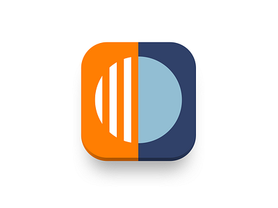
Calm. App Icon
This is an app icon for my Daily UI#005.
Calm is a meditation and mindfulness app. The goal of the illustration is to communicate the purpose of the app, that is to help people to become calm. So how to illustrate calm, which is an abstract state, in simple forms? I would like to share some thoughts that bring this illustration to life with you.
So if calm is a state, and people want to get there, there must be another state in which they are now, and want to get rid of it. We call it stress or anxiety. Stress and calm can’t exist without each other. As well as you can’t be both stressed and calm. And there is a transition from one state to another. So I illustrated two parts of the whole, which are the states of one person. The left part is stress, brokenness, anxiety, and right part was left for calm, fullness, focus. I used orange and blue colors to indicate these states and make them distinct.
I hope you like it and would like to hear your thoughts/ideas. Comment below!
Show some "L" if you like it.
