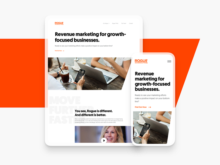
Rogue Marketing Website
We had the pleasure last year to work with Rogue Marketing on the redesign of their site.
I wanted to keep the design simple and allow their content to really shine through. Looking at their logo, I immediately noticed the notched "E" in Rogue and used that angled element as a motif throughout the site.
— Ready to build something with purpose? Let's chat! 🌵
More by GOODFOLKS View profile
Like
