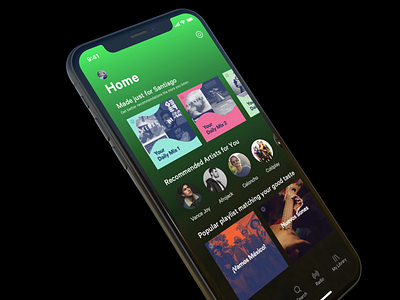
Spotify Home Screen UI Concept
UI concept for Spotify home screen I did a while ago.
Think Spotify should play more with it's own identity impacting recommended or personalized albums. Really wasting an opportunity to showcase their branding. I think going back to simple could make it look better, making a better stand vs. Apple Music.
More by Pedro Marroquin View profile
Like
