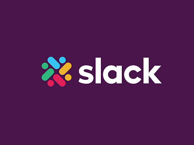
Slack Logo Fixed
I just got the update that slack has already updated their logo. You can read more about the case study here https://www.pentagram.com/work/slack/story
However, I personally don't find it pleasing because of how much different does it look and the representation of the speech bubble does not resonate with me. The color arrangement also has swapped in the new logo. I've been using slack for many years and I've never see Slack use speech bubble. This only reminds me of facebook message or iMessanger.
So after seeing the new logo, I just felt the need to make a slight difference in the logo to match the old design without discrediting the designer who worked hard on the new logo. I rearrange the colour to match the old design (Clockwise, yellow, red, green blue) and remove the speech bubble and make it round instead to match the users "online status". This is because whenever I got into slack, I check my teammate online status first.
However, this is only my take and I did not design the original logo.
