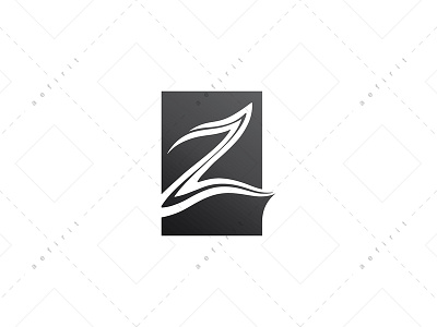
Z Black Monolith Logo
Concept:
Awesome, elegant, modern. Inspired by the essence of the monolith. A double line stroke gives shape to a Z that is immortalized in an obsidian block.
The freedom of the layout of the Z and its fine details are the soul of the logo, they attribute elegance with an artistic and human touch. The black rectangle, representing the volcanic rock, complements the shape of the letter with a geometric figure, providing balance, solidity and presence to the logo. The small edge on the tail of the Z, is a modification that lightens the rigid appearance of the block and serves to highlight the extension of the final stroke of the consonant.
The dark gray value accentuates the personality of the logo, highlighting the elegance of the concept.
The organic form of Z denotes a mark made manually by man. This is a reference to the presence of the man behind the brand, involving the manual, the artistic and the originality in the image of the company, while distancing the concept of industrialization and generic product creation.
Thank you for watching! :)
You can see all my logos for sale here:
https://www.logoground.com/designer.php?did=17803
