E-Commerce Shop
Hello! Here is the #012 shot for Daily UI challenge.
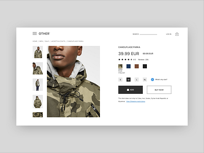
My goal for the Product page was to make the key information highly visible for a user.
That's why I separated the primary information from the secondary one and displayed it on the top of the page. It enables users to see the product itself, the price and evaluate it towards customer reviews rate, as well as choose the color and size.
The product details, care and fit were considered as secondary information and placed to the second screen below. The key focus is on the CTA.
The photo's source: https://www.zara.com
Hope you like it! Happy to hear your thoughts...
More by Olena Tsytovych View profile
Like
