Government-held competition sucks sweaty balls.
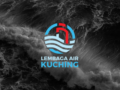
One of the many variations I did for the Kuching Waterboard logo competition back in December 2018 and I chose this one for the final submission. I constructed the logomark in a manner that would best pay homage to the previous logo, which it had an overall round shape. I apply modernisation to apply freshness to the logo as well as the colours.
Let's hope I win this one.
More by Fyzan Mohtar View profile
Like
