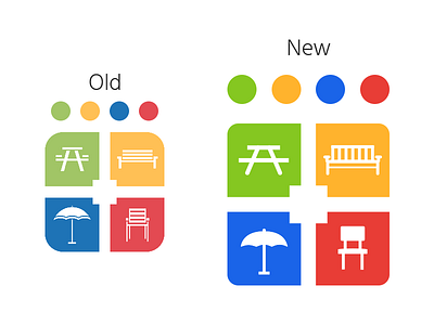
Furniture Leisure - Logo Revision
Being the start of 2019 it was time to look at what in our company was starting to age. Around a year and a half ago I made the latest logo shown on the left. Within that time we've had multiple website refreshes so I decided it was time to take what I've learned over the last two years and put it to use. The Old logo was very rough. It was made in photoshop by combining shapes and rasterizing. The new one was created in a vector software (Affinity Designer being my preferred choice) for scalability. Each icon was to reflect its original appearance but with a basic redesign allowing for users to identify each piece of furniture at only a glance, something not found in the older one. The colors were also updated to be more vibrant, a showing of the colors for our new websites designs.
----------------------------------
Need help on a project? Contact me at bmalcomloepke@gmail.com.
