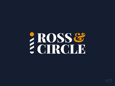
13/50 Daily Logo Challenge | Barber - Ross & Circle
Day 13 of the Daily Logo Challenge. Oops! In such a rush to catch up I've got my days confused, please enjoy two uploads in one day!
Prompt: Barbershop
Company: Ross & Circle
As much as this was shouting out for a vintage style design and as much as I wanted to take on that challenge unfortunately that is not a style I've had any experience with and with the 75min time limit I've given myself on this project I didn't feel I could do that design style justice.
Instead, this final design uses a bold block serif font to give a more luxury feel while, even with the flamboyant ampersand, providing a more masculine feel than feminine. The accompanying icon is a simplified barbershop pole made from geometric shapes, I imagine this being used as an additional background element or where the space is limited.
All comments or questions welcome,
roast my design below.
