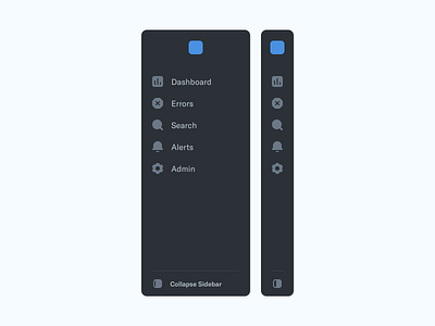
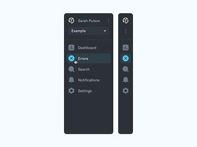
Revised Sidebar Navigation
We completely simplified the navigation here. Taking away most of the User controls and putting them elsewhere in the design that makes more sense. In turn, this cleans up the navigation completely.
We also made the icons considerably smaller. Oh and made changes to the toggle sidebar icon, which is my favourite 🌚
PS- The blue dot is just a filler icon to protect the company name.
More by James View profile
Services by James
Like


