Site Design Rev 6
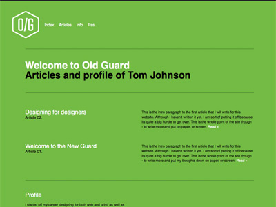
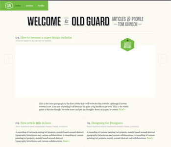
I started building the previous rev of the design (the shot this is a rebound of) and ran into some issues. Areas of the layout where I had concerns did not work well with the number of page layouts I want to use.
SO...I stripped everything back even more and came up with this which I am happier with. There are also two other sections built using the same layout and grid and all the information fits and looks consistent - which is what was lacking from the previous version.
I suspect working on this in my spare time and enjoying it too much is drawing out the process of this site A LOT, but im not really in a rush to get it live and want to really get it right.
More by Tom Johnson View profile
Like

