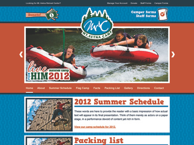
Mt. Aetna Camp Web Design - WIP
Hey guys - I'd love a little input and help on this project!
Our client is a retreat center during the year and hosts summer camps for children - the two are considered separate. So I've been tasked with designing one basic, flexible layout and skinning it for the retreat center and for the summer camp. This, clearly, is the summer camp's skin.
The input I've gotten thusfar is that it is too boxy and not playful enough. I'm a little at a loss as to how to make it more playful - I chose cyan to reflect their existing brand and orange to be a bold, playful contrast color. I have some great action photos provided by the client that I'm thinking about incorporating to break the boxiness a little bit, but I'm not sure how that will work out. Any input anyone has is more than welcome!


