Cecif back office
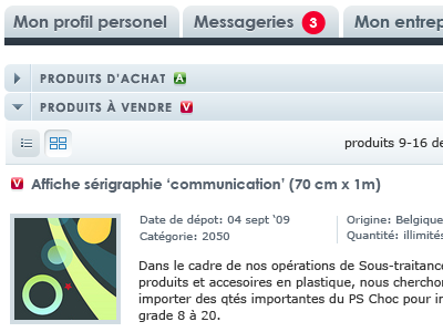
I've added more contrast in the design. I've also been able to remove the 2 level tabbed menu. The initial design was 'trop jolie' according to my client and he was actually right. Way too light in color, too much light blue and pastel colors. I interpret his reaction correctly and now things are approved :)