UI Buttons
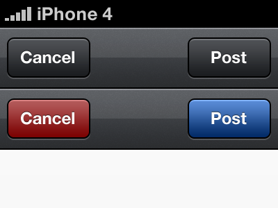
Please let me know on which set of buttons you prefer, colours or no colours?
PS. These buttons are for the Compose View. The dark buttons will be native across the app, but I was wondering if the coloured buttons would be nicer for the Compose View.
More by Mathieu White View profile
Like
