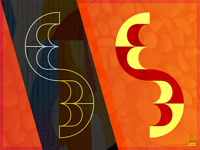
E3 Logo Idea
I've always looked at the Electronic Entertainment Exposition(E3) logo and its changes over the years. It's quite simplistic, and there is of course nothing wrong with that at all. I do feel that the exposition has so much to offer and that its logo can offer even more.
This logo redesign idea is a fusion of the letter E and number 3 stylized and adjacently stacked over one another. They’re joined at the “hip” to signify the connection made by user and device/console in regards to gaming. I did it for fun and to see what I would come up with.
If you've never seen the official E3 logo I'm including an attachment that you can check out with this shot.
adobe illustrator
branding
conceptual design
convention
e3 logo
electronic entertainment expo
figuros
illustrator
logo design
logo redesign
logos
redesign concept
redisgn idea
View all tags
Posted on
Jan 13, 2019
More by Jimadorii View profile
Like


