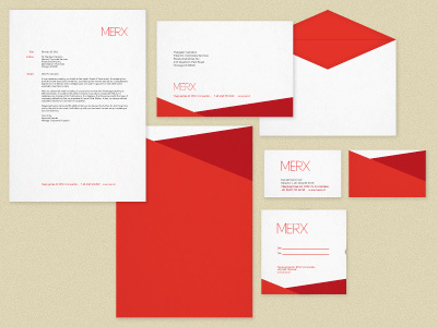
Concepts/Drafts for MERX identity
Quite a long explanation, but it'd be great if I could get some feedback on whether this identity is relevant and workable. Thanks in advance!
I've been working on a new identity for this digital and brand marketing agency. The red shapes are really quite unrecognisable by this stage, but they started out as a sort of origami 'M' shape, inspired by the event organising section of the agency (a sort of 3D, reality representation of the letter). After some distortions, the digital part of the agency gave birth to the sharp vector lines you see now.
More by Jun-Yi Lee View profile
Like
