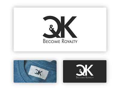
Apparel logo design
The logo is a letter mark Q&K.
It looks very simple and modern with a luxurious feeling, and serious as well with the font used.
The connection of the two letters is showing how the brand will be connected to its customers to make them feel beautiful and to fulfill their needs to feel special and comfortable with its services.
The angles of the cutting edges of the "Q" is the same as the angles of "K" legs reversed to show the both sex genders it is selling to, and also how equally it does treat its clients male of female, young or old. And the reason it is cut is to make the logo open in both sides to show how diverse it is, and to make it work in a circular and square shape as well (for icons use for example).
For the color, I used black and white. It speaks luxury, elegance, power (king and queen), diversity and it works everywhere (see Apple and Nike for example).


