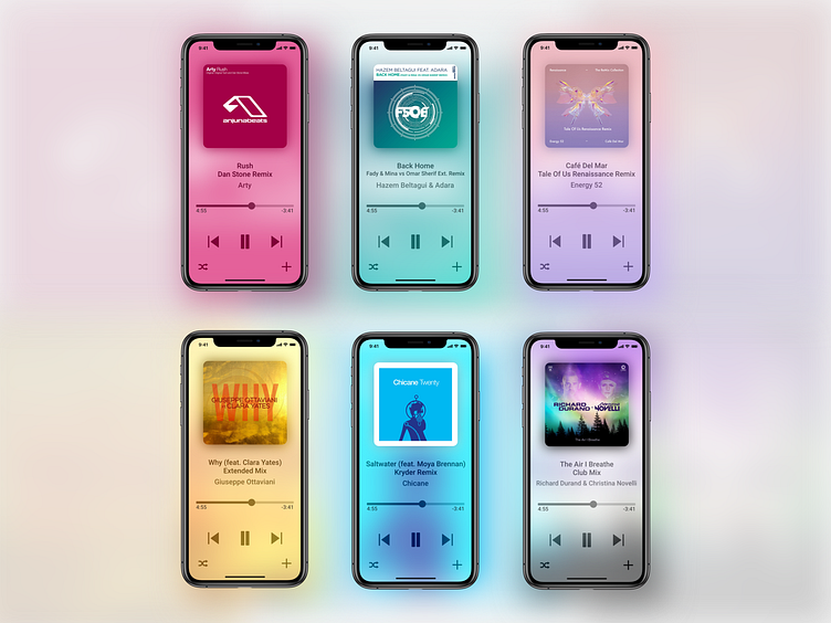
Daily UI 009: Music Player
Colours! This one was a lot of fun.
Fairly standard as far as music apps go, with a few exceptions.
A minor thing that annoys me in music apps when playing electronic music is that a track's original title plus remix name/artist is just considered to be one long title. That means it is forced onto a single line, which usually overflows the viewport, which is then solved with an automatic horizontal scroll. It's not really fun to wait for it to scroll just so you can see the full title.
It's 2019, I'm sure we can manage a little text parsing. Ergo, two separate lines.
I also did away with the album title, because I've never really looked at that anyway. Most of my albums are singles, and besides, the artwork is right there. I'm sure the title could tucked away somewhere.
