Shared workspace concept.
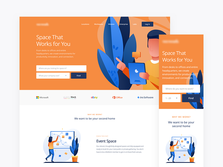
I wanted the hero section to look strong and engaging through the use of colors so the user immediately associates them in the future.
In this concept, I reimagined how illustrations could support the website in this industry. Due to obvious reasons (physical space), most of co-working websites use primarily photographs to appeal to their potential customers, but I wanted to try something different.
The most important user input needed to recommend available spaces is location and company size info. I came up with a standard form fields and a contrasting CTA so it’s clear and easy to proceed with the request.
More by Bartek Gadzina View profile
Like
