Script progress
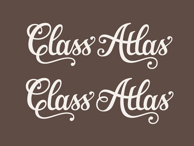
Would love some feedback on this lettering I'm working on. It's for an educational resource and it needed to reflect a cartography/navigation theme in an elegant style. In terms of intended use, it'll be primarily for printed materials and won't need to be used at really tiny sizes.
The overall concept is approved (although not chosen between these two alternates yet), I'm just working on refining the details. Specifically trying to improve the balance between both words, but I've been looking at it too long and it would be great to get a fresh perspective.
Bigger version and sketches attached.
More by Claire Coullon View profile
Like


