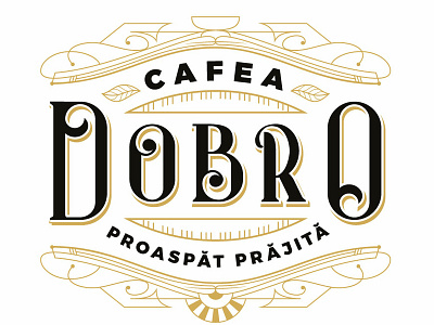
Dobro Cafea
Rebranding for a roastery in Romania. For roastery branding I noticed a predisposition for sans serrif, strong lettering. We decided to contrast this tendency by using strong serifs.
In the construction of the letters the golden section was used, the kerning was generated by the hole inside the small O and the supporting graphics were inspired by coffee related items.
More by kanavu.ro View profile
Like
