Eyecandy Signs Mood Board
Mood boards are a valuable resource that can be rapidly created to generate a foundational look and feel. This one is an unused concept direction for a very talented local signage company. This was developed as an initial pass to gauge interest and buy-in from both the client and their target audience.
Primary Colours
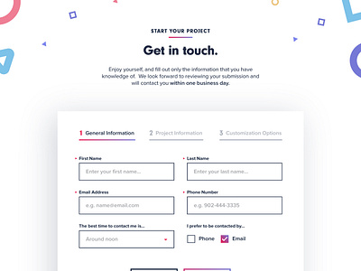
Strong, bold, vivid yet reserved. The eyecandy web palette commands attention and provides a vibrant splash of colour to separate it from the varying tones in the signage photography. Perfect for calls to action and key messaging, the red and purple tones invigorate users and spawn activity. Subtle gradients have also been introduced to further create depth and visual interest.
Typography
Strong, friendly and characteristic; the typography within the eyecandy mood board is approachable and legible. Heavy weighted heading fonts help communicate stability and strength while the subtle variations within the letterforms, as well as the rounded style, creates a friendly but refined tone.
Shapes
Designed to help communicate the diversity, creativity and passion behind eyecandy’s body of work, a collection of primary shapes offsets the otherwise minimal and subdued atmosphere of the design; creating a subtle but fun edge.
Are you looking for custom web work for your next big project? We would love to hear from you.

