Brand Color Palette
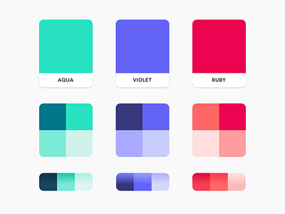
In the process of creating our custom illustration library, we developed a modernized version of our brand color palette to address the need for a greater variety of and better colors. We took queue from the energy of the neon aqua that we had found to be successful within our design system and created equally vibrant values in two complimentary hues as well as four background fill options and three gradients for each colorway. In addition to use in our illustrations, this new palette also helped us refine our product design pattern library for accessibility compliance, because of the higher contrast ratios available in this new color set.
.
.
.
Color palette development: Rachel Brooks, Elona Jaquez