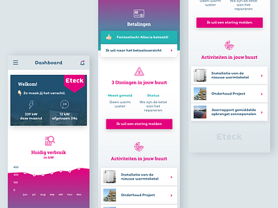
Mobile UI - Feedback please!
Hey guys, thank you for your time. More than anything else, I'm looking for feedback and your opinion about this design. Please check the attachment for a high resolution isolation of the design.
It's a concept dashboard design for a consumer app. The client is a supplier of energy and the target audience are consumers which have their energy supplied by my client.
The brand personality is based on two archetypes: the Explorer and the Everyman. I've tried to incorporate the Explorer archetype through application of bright color and color gradients. The Everyman archetype is mainly incorporated through usage of Emojis.
I'm really excited to show you this piece of work. But like I said, more than anything I would like to receive your opinion. Do you like it or don't you? What could I do to improve it? Help me bring this piece of work to the next level!
Thank you in advance and happy designing folks!

