Ford.com | Global Redesign
In late 2015, while working at Global Team Blue (formally Team Detroit, it's complicated), Ford.com was due for an overhaul.
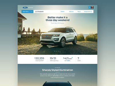
There were no meetings for this project. It only one directive: Imagine the potential for the next iteration of Ford.com. This is a portion of the prototype that was developed to communicated new design features and branding.
---
NO BOXES
Beautiful photography of the Ford vehicle line-up was exceptional, yet confined by tiny bounding boxes on the page. I designed my experience with an editorial style layout, breaking the vehicle box which provided a larger and more heroic use of the photography.
EXECUTING
The larger product photos integrated into the page design allowed for bigger branding and larger product placement. Ford's investment into a global redesign of their enterprise site, was solved by design solutions that were simple, elegant and logical. Their decision was unquestionably the right one.
–––
Project members that sold the prototype through:
@Doug Kohnen, Adam Morris, Doug Wojciechowski, Stu O'Neil

