Interaction19 Wayfinding Banner
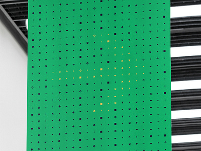
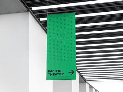
This banner was meant for large scale wayfinding, featuring a geometric grid pattern that is used elsewhere in conjunction with a more organic, procedural design. The yellow arrow appears more like a punch-out from a distance with the location below easily readable, with the intricacies of the grid only visible upon closer inspection.
======
Interested and want to learn more? See my overall description of this project here; https://dribbble.com/shots/5803636-Interaction19-Logo-Sticker
More by Justin McKissick View profile
Like

