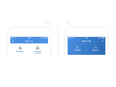
Park 'n' Go Redesign
This is a before and after shot of secondary selections. This part is elegantly visually differentiated from the more important rest of the screen so that it doesn’t distract the user. Be sure to check out the full case study in the link below to see more details!
👉 Full case study (It's worth it! 🔥)
Don't forget to leave a like (press “L”) ❤️.
We would like to hear your feedback as well 💬.
More by nextap ux View profile
Like
