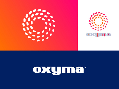
Oxyma - Unused Concept
Visual identity design for a Moroccan Gas station flagship called Oxyma.
This project is still ongoing but this concept (my very first) was went unused. The new one attached is currently approved.
I personally loved this playful and dynamic look and feel of the O + wavy look this mark made. Something about it which makes this interesting to look at..
More by Jeroen van Eerden View profile
Services by Jeroen van Eerden
Like


