Rethinking Google Translate
I started working on improving the accessibility of Google Translate, as a part of the "functional design" exercises that I and @Sahil Dave do.
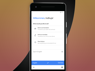
Although the tech in Translate is great, there are multiple problems with the current UX of the Android app and the mobile web. The main action, that is the text box (and the language selector), is difficult to reach. And that's just scratching the surface.
The aim is to guide by color and hints like "Type in English". The other actions - Camera, Handwriting, Conversation, Voice - are still available to the user. Notably, Camera and Voice are located, again, at the bottom half for quick access.
As for the general UI, I've kept material design 2.0's aesthetics in mind with components from various other apps like Google Tasks, Google News and Google Assistant.
More screens and interactions will follow.

