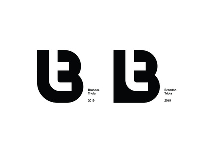
Left or Right? Please comment!
New year calls for a newly updates, more simplified, "B + T," icon. Here's is what I have narrowed it down to. Would love some feedback on these. I'm leaning towards the rounded angle on the left because it helps bring out the natural shape of the curl in the t but I'm just not sure. Thanks in advance Dribbble community!
More by Brandon Triola View profile
Like

