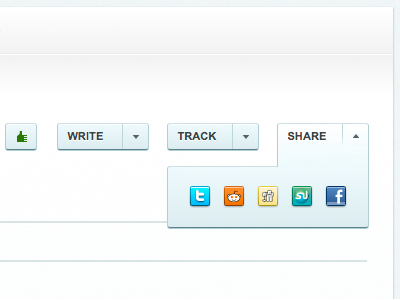
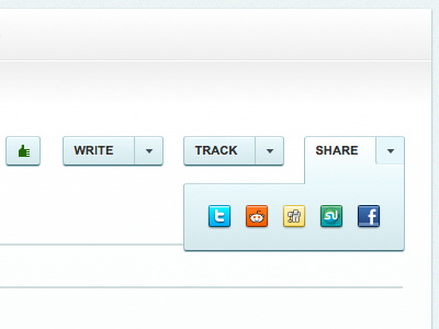
Button Tweak
the only other thing bugging me was that little box for the arrow on the right of the expanded button. i think there's still a lot of empty space between the main verb (share) and the options in this, which could probably be improved too.
More by River Brandon View profile
Like

