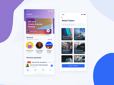
Podcast App Home Screen
Here goes another awesome shot from the Podzie App.
Home Screen or feed is where the user can see all of their podcasts, suggestions and updates from the podcasts, the user is subscribed to.
The Topic Selection Screen is a part of the onboarding process and also doubles up as a search and explore screen to help user find the best podcasts for them and discover some great content.
Podzie is a podcast app that helps you listen to your favourite podcasts from a simple app inspired from Google’s latest design language.
🔥 UI KIT is also coming soon this week 🔥
What do you think about it ? 📩
Please leave your comments below.
----------------------------------------------------------------
Available for Projects.
Work Enquiries : sahilhost0h@gmail.com
______________________________________________
Please hit L or the like button if you like it.❤️❤️ 💖
Follow me


