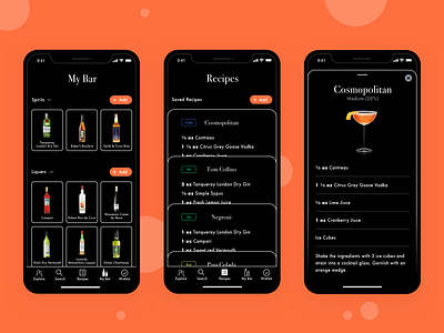
My Bar - Cocktail iOS Mobile app
Lately I came across a presentation by Google, saying the most battery draining color for mobile apps is white and the lesser one is... you guessed it- black :)
(read about it here: https://www.slashgear.com/googles-big-android-battery-oops-and-future-dark-modes-08553037/ )
This are my recent fascination with cocktail recipes inspired this
darker UI experiment. As for the structure of the "app", I basically designed it for my own needs: "As a user I want to have a place for my cocktail recipes, I want to track the inventory of my bar and I want to get inspiration for new cocktails, specially ones with ingredients I have in stock."
Some of these screens you can see here.
---
More by Katrin Zotchev View profile
Like

