Rdio
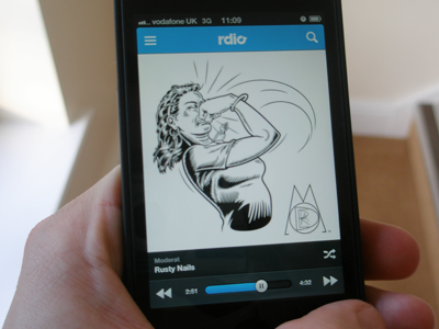
Rdio app concept.
I've replaced the play/pause button with the track's progress indicator. Tapping the progress dot would pause/resume the track. To scrub forward or backward you would hold and drag the dot.
Track navigation is handled either by swiping left or right (to skip to previous and next respectively) or using the previous/next buttons.
I have purposely left out the replay button as this action can be triggered by pressing the previous button once. Interaction was based largely on the Spotify app.
Top left is the main menu button and top right brings down the search bar.
I fully expect the gradient police to come after me. There isn't a great version of the Rdio logo out there, so had to use a .png, trace it and pixel-nudge the fuck out of it.
I'm pretty sure there will be logic / interaction flaws in this as I am still cutting my teeth, so any feedback is greatly appreciated.


