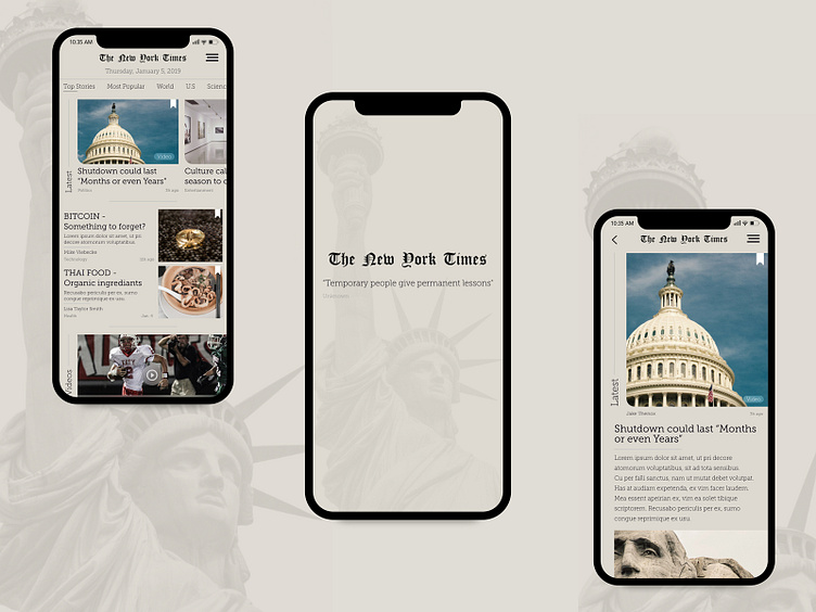
The New York Times app concept
Hello everyone!
Different way of displaying editorial content. Does this interface provide the user with a sense of how to navigate / interact with content and what kind of content is it?
Is this way of displaying editorial content intriguing and does the content blend well together?
Hope you like it, also any kind of feedback is welcome.
More by Tine Tomazic View profile
Like
