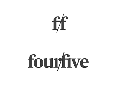
fourfive, option 2
After nearly 7 years heading up design at Funding Circle, I'm going it alone and setting up my own consultancy which I've chosen to name fourfive: a bit of a film photography reference while staying reasonably abstract.
With a first project lined up already, I'll be available from late February for design leadership, practical design/UX and photography work.
For now, I'm narrowing down options on my company logo. While I don't want to go too heavy on the 4x5 photography reference in the logo itself, I do want a hint of a reference to that large format film ratio and so I'm playing with a couple of ideas.
For this one, I went more obvious on the ratio theme by using the slash notation. It's clearer which could be a blessing and/or a curse: the company name is 'fourfive' not 'fourbyfive', so I don't want it to read too much as a ratio but the slash feel quite clean on the full logotype. It does also crop up as a 'thing' in plenty of other logos too though, so there's that.
Thoughts welcome!
