fourfive
After nearly 7 years heading up design at Funding Circle, I'm going it alone and setting up my own consultancy which I've chosen to name fourfive: a bit of a film photography reference while staying reasonably abstract.
With a first project lined up already, I'll be available from late February for design leadership, practical design/UX and photography work.
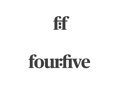
For now, I'm narrowing down options on my company logo. While I don't want to go too heavy on the 4x5 photography reference in the logo itself, I do want a hint of a reference to that large format film ratio and so I'm playing with a couple of ideas.
For this one, I'm embedding the colon notation style: possibly a bit too hidden in the full logotype and possibly a bit too obviously in the monogram/icon.
Thoughts welcome!
