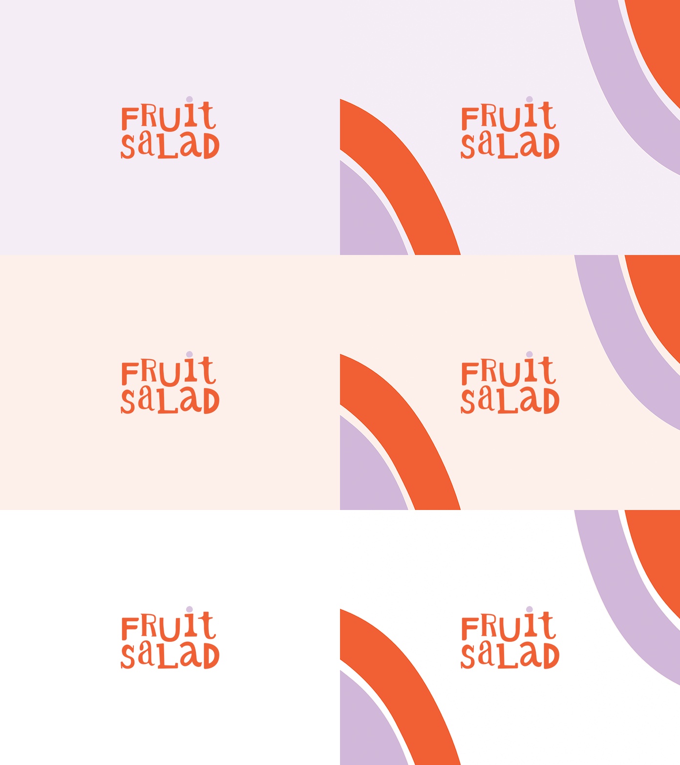
The Fruit Salad Logo
The Fruit Salad is a lifestyle and wellness blog, dedicated to a variety of subjects. I wanted a logo that reflected the essence of the namesake— a fruit salad of letters with mismatched forms and a dynamic type line.
Decided to ditch the actual fruits in the logo and identity package and instead used their very basic shapes to suggest fruit; like the watermelon rinds bleeding off as a border. A little less on the nose.
More by rosee qualls View profile
Like
