1 Thing A Week redesign, meta component
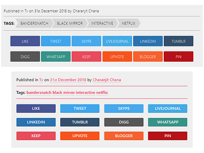
Top/Before
Bottom/After
I've been slowly working on a redesign of one of my websites and decided to take a step back and start from a point I probably would have left until later. Typography.
To reduce page load time and resources I decided to use system fonts instead (as seen in both) but experimented more with weights and spacing cc/ Steve Schoger :)
This was a work in progress, but seeing the tags without any frills other than additional weight, I think it makes the area a little more friendly and now the sharing links have a bit more prominence. I will probably go back to 6 on a row and perhaps I'll scale them down a bit more too but I'm at a point where I'm happy to leave it as it is and move on to the next area that needs work.
Screenshot taken in Chrome on Windows, hence the horrendous font rendering.
