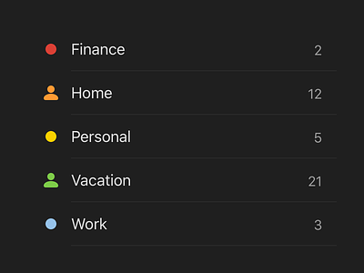
Todoist Dark Theme Colors
As part of the dark theme introduction in Todoist, we took the opportunity to review all of the colors that users can chose from in order to customize their projects, labels and filters.
The problem: Some of the colors had poor contrast against the black background colors in the new dark theme. We also found that some of the existing color palette did not have enough variation and some swatches were visually quite similar.
The solution: We created a new palette of 20 swatches which have been tested for contrast and legibility on both light and dark themes. The result is that projects as well as labels and filters now share the same palette. It was important to maintain the palette as much as possible as we were mindful that some users heavily depend on the color customizations they have set up. We chose to consolidate colors in some areas, such as the amber and red/pink tones and create new colors elsewhere in the palette such as purple and dark green. We think that the new color options are more harmoneous and diverse, whilst preserving the legacy color options for some of our users.
–
What's Todoist?
Todoist is a productivity task manager that keeps all your to-dos organized, prioritized, and actionable. Learn more about how Todoist can help you stress less and do more at https://todoist.com.


