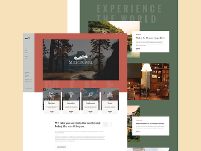
Micetravel
New year new project! This is the current project that I've been working on with my European client. They want to rebrand and revamp the current website with a total fresh look.
The website targets companies who wants to travel with their company. Groups, conference and events. The main focus is to show off their skills and their projects/cases.
Some key points that client wants and visualizes for this website: Earthy, green and beige. Leather, wood, sand, grass. Which lead to a more environmental friendly and vintage kind of feels.
And interesting fact, this is the very first project that I've tried and design the side bar menu. Never try this for my pass projects before and it's gonna be interesting when I code this out after the design is complete.
P/S: This is not the final design, just the 1st draft to let client feels about it before I made the changes again.
Press 'L' to show some love, cheers! :)

