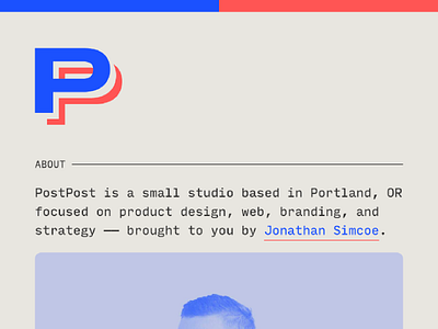
The new PostPost website
I couple days ago I rebuilt the @PostPost website using Gatsby. I still kept the minimal aesthetic but added some small flourishes, with more advanced form processing via @Netlify.
Also I'm still exploring the "edges" of the PostPost brand aesthetic. I've stuck with the warm muted neutral and the bright blue and red, but have shifted the type over the past month or so the beautiful monospaced font Input Mono by @David Jonathan Ross.
There is still much to explore visually and under the hood with Gatsby and React, but the site as a reflection over the always-in-flux state of running a small venture.
More by Jonathan Simcoe View profile
Like

