Control bar updates
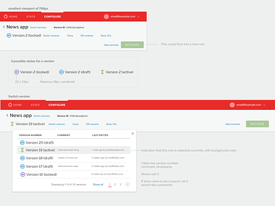
These aren't really redlines, but a summary sheet of the key changes to the control bar to communicate with our engineering team as they work on the updates.
With these changes, the intention is to reinforce the hierarchy in the bar and make the available actions and navigation options more clear. We reduced the number of font sizes and weights, streamlined the "Version X (status)" into one line, and removed icons for the secondary actions.
When switching between services and versions, the cue is a very explicit "switch services"/"switch versions" link. The switching dropdown is enhanced to show additional information, such as last edited, comments, and what the active version is.
More by Fastly View profile
Like

