Work In Progress
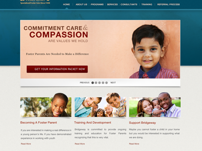
This is a work-in-progress mockup. The client was firm on certain colors and pictures, so I did the best with what I had. The only thing that is bugging me is the top main nav.
Their logo is a pain to work with. So I did not do much with it till they give me a full rez version.
I was going towards a professional, fun, caring look and feel. With a finishing touch of experience.
I think there is more that can be done with that top nav. the rest of the site seems to flow better, but that top part seems too flat and lifeless. All comments/critiques/etc are welcomed. Any suggestions??
PS: The ad is theirs, but I am thinking of pitching a better ad design
More by Danny Montes View profile
Like
