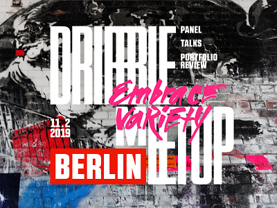
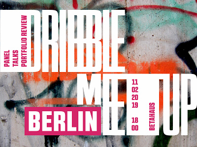
more "Berlin-ish" Dribbble Berlin meetup cover
I believe there should be a solid externally-driven (!) reason behind every rebound. In case of the upcoming meetup cover these were user testing and work-in-progress design research.
Testing the concept on my Berlin-based friends who are somehow connected with design gave me a first push to iterate: “Too-o-o clean background as for Berlin walls”. Well, let’s admit: the feedback was fair - I felt the same.
That was a design research that killed me emotionally for a day. And attempt to search for a similar or close concept brought me to Pentagram’s recent campaign “Shakespeare In The Park”. Responsive letters are not the brand new idea, but… Have you ever found out that your crafted from the heart and through four revisions of Adobe AI file concept goes under “There is nothing new under the sun” rule? You see it and the only thought “Oh, f***” evolves into “ahhhh, I cannot keep it like this… ” Means, it is not that happy end you thought before!
So I evolved the concept… backwards! Not it is exactly the idea I sketched two weeks ago. And it is “more Berlin-ish” now, as second user testing proved.

