Archi
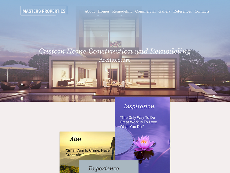
This design is web-design of site of home construction and remodeling, it`s made in minimalistic style. I have used colours: white smoke, light grey, heather to make site light, gracious and modern. I have used font-face Radley because it`s very practical and extended to be used on the web. I have used icons for acceleration of perception of information. I inserted images for demonstration of main qualities of the company, I have made logotype in form of simple text. I`m waiting any comments.
More by Anastasiya Filpenka View profile
Like
