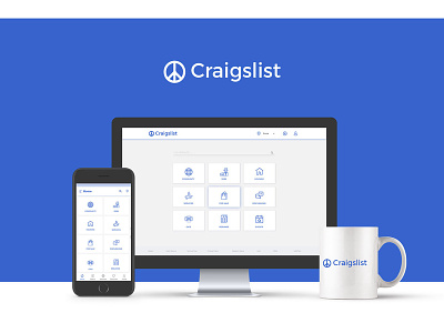
Craigslist Redesign
In this design, I used the same resource materials like data, links and sections on their site and came up with Flat + Grid layout which places each component neatly.
Rather than having something like 1,000 links on the first page, I chose to hide the majority of the sub categories and display the main ones. I made Icons that reflected each category to create a clean interface, where people can use the icons to help them see what craigslist has to offer, as well as seeing what the site is all about and hopefully feeling a deeper feeling of community with the site.
More by Ganesh Waghmare View profile
Like
