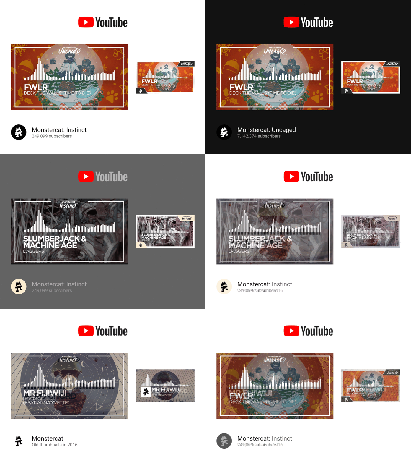
Monstercat: Instinct & Uncaged Thumbnail Concept
History
Ever since Monstercat split its YouTube channels in two — to “Monstercat: Instinct,” and “Monstercat: Uncaged” respectively — the thumbnails of the channels had to be changed.
Throughout the history of Monstercat, I’ve looked to them as inspiration for design and art, because the kinds of artworks on new releases nowadays can sometimes simply be mindblowingly beautiful.
The original thumbnails were beautiful and minimal.
Problem
After the split, they first just recolored the backgrounds for new uploads — Instinct was a faded yellow & orange, while Uncaged was gray or sometimes just pure black.
That meant that the beautiful artwork wouldn’t show through and the branding of the channels was more important the tracks itself.
Solution?
The example shown in the screenshot shows their current thumbnails which I personally dislike for many reasons:
1. The font doesn’t match up to what’s in the video. For some reason.
2. The white border is too thick and distracting, especially when it’s dark…
3. The branding — in general — is kind of just thrown in there without much of a focus on… anything.
I could also argue about the sizing, but that’s more of a personal preference.
Solution!
My proposed design fixes all the problems I described.
1. The font is the same.
2. There’s still a border to draw attention to the video, but it’s not so distracting and disturbing with dark mode.
3. The branding is quite literally front and center. There’s not really a point to having the Monstercat logo in there, ‘cause it would show up on the channel icon next to the thumbnail. Plus, it looks really akward with the cat and the text. (I’ve tried it. It’s suboptimal.)
Hire me!
While I am not affiliated with Monstercat, I can be affiliated with your company or project. Give me a shout: https://mnts.lt
