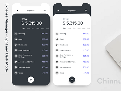
Expense Manager - Light and Dark Mode
So this will be my 2nd shot of the design practice I do by myself I call it "Design Morph". Where I get to inspired by the great design of one domain and morph it into something other useful design in other domain...
.
My process for the practice is as follow:
1) Grab The Inspiration
2) Select the domain to morph into.'
3) Do research about the domain to morph into
4) Mid-Fidelity wireframing with typography and real data
5) Final UI design
.
.
Step 1,
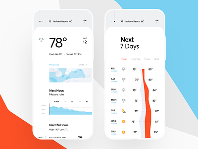
So, the inspiration for the project is Weather App Redesign
by amazing @cuberto
.
The key point for inspiration was backdrop UI and minimal front sheet. In this Expense Manager UI, I kept menu on the backdrop and Monthly expense on the front sheet.
.
Step 2,
Domain I chose to morph into was expense manager UI, which needs to be so simple to use, no distraction of ads, easy to use yet a compelling design that encourages the use of the app.
.
.
Step 3,
I did some research about real data about the monthly expense of the average American citizen , here is the link to the data I used.
.
.
Step 4:
.
Mid Fidelity wireframing with real data is posted on Instagram.
.
.
Step 5
Final UI design with the dark and light mode is presented here.
Let me know what do you think about it. Press a little "L" if you like it.

