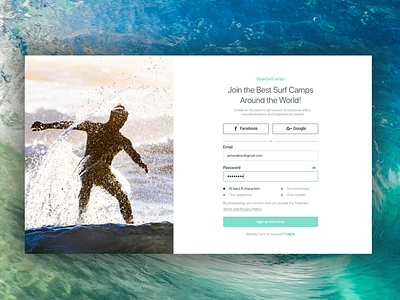
Sign Up Form for BookSurfCamps
1. The goal was to make the sign-up page simple and straightforward for a higher conversion rate.
2. The only necessary information is collected from the user.
3. Core message reminds a user all the benefits of the service and encourages to complete the task.
4. Third party accounts registration enables users to bypass the sign-up form with a single click.
5. Split-screen was used for reminding users of the values that the service can provide and encourage them to finish the sign-up process.
6. Password hints provide requirements on how the password should be.
7. Labels were placed above the text fields according to NNGroup usability requirements.
8. By clicking Sing up button a user automatically consents with Terms and Privacy Policy.
More by Olena Tsytovych View profile
Like
